RuledPaper
Free printable · PDF, PNG, SVG
Plus Sign Grid for Design Layouts
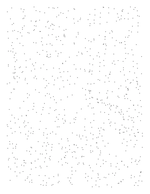
This sheet spreads tiny plus signs in a regular pattern, a common background in design tools and sketchbooks. The marks are small enough to ignore while you sketch, but they let you snap boxes, columns and margins to a consistent rhythm. It suits designers who plan screens, posters and page layouts on paper before opening software.

Preview of page 1. 215.9 mm × 279.4 mm. Print at 100% (“Actual size”) to keep the spacing exact.
What people use it for
- Mobile and web wireframes drawn by hand
- Poster, flyer and magazine layout thumbnails
- Storyboard frames for video and animation
- Slide deck planning on paper
- Logo construction sketches on a light reference grid
Tips for plus grid
- Pick a spacing that maps neatly onto your digital grid, so a paper wireframe translates into pixels without guesswork.
- Choose A3 landscape for desktop layouts and portrait Letter or A4 for mobile screens drawn at a larger scale.
- Download the SVG if you want to import the grid into a design app as a background layer.
- Keep the marks pale gray so marker sketches and annotations stay the most visible thing on the page.
Printing tip: in the print dialog choose Actual size or 100%, not “Fit to page”, or the spacing shrinks slightly. How we keep sizes exact.
Questions
How is this different from the cross grid?
Both mark grid points with plus signs. This variant uses smaller marks and is intended as a subtle background for layout work, while the cross grid is set up for precise technical sketching.
What spacing works for app wireframes?
Many interface systems use an 8 point rhythm. Setting the grid to a clean value, such as 4 mm or 1/8 in per mark, makes it easy to keep consistent spacing across screens.
Can I fit several storyboard frames on one page?
Yes. Draw the frame borders yourself along the marks, which keeps them aligned. The grid makes it quick to divide a page into equal panels.
Will the marks show up when I scan my sketch?
Pale marks usually drop out when you scan in black and white or raise the contrast. Use a darker color only if you need them to remain visible.